ZenGrove Design system
As the Head of Design, I was responsible for overseeing the entire app lifecycle, from conceptualization to execution, ensuring it aligns with strategic objectives while delivering value to users and stakeholders. and helped News app grow its business revenue. Articulate a clear vision for the app, aligning it with the company's objectives and user needs.
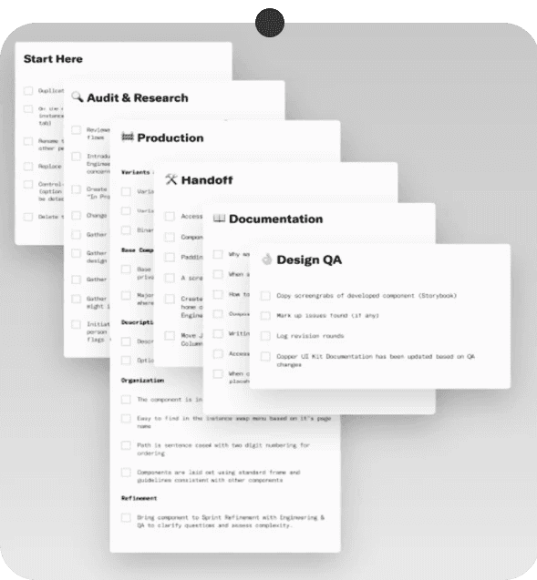
Created and built a design system to unify components, styles, grids, typography, and iconography to improve the efficiency of design delivery.
Tools
Highlights
In 16 weeks, I delivered ZenGrove’s design system with ready-to-use components and governance in place.
At the end of our engagement, the product teams were using ZenGrove components for 73.2% of their product builds.
Overview
This startup, a digital-first news app and procurement SaaS, serves as a robust news aggregator, compiling global content into tailored summaries for users.
Recognizing the need for a design system, they sought an expert to enhance their small team's efficiency. The design system is pivotal in streamlining the digital experience creation engine.
Elevating the essence of design to new heights
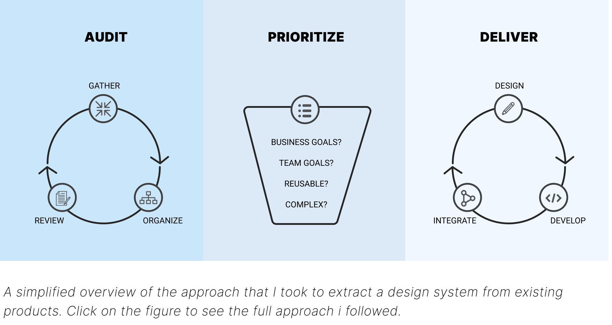
I conducted in-depth research, exploring competitors, understanding user preferences, and tracking industry trends. Simultaneously, I examined existing design elements for improvements, crucial for NewsApp's rebrand. Collecting insights about our products, I structured discoveries, defined objectives, and led collaboration. The process was flexible, adapting as needed.
In the Research phase, aligning with business goals is key. Evaluating existing design patterns in workshops, we enhance user-centricity. Researching user behaviors and market trends forms a foundation, shaping our system's direction. Discussions with the dev team and real-time user feedback refined our system's needs. The initial research was pivotal in NewsApp's brand identity inception.
Starting with product insights, I shaped a cohesive system, defining priorities. Collaboration began dynamically, adapting at each stage.
Following an in-depth analysis of popular design systems' guidelines and components, several common principles emerged. From these insights, we selected three key pillars for our system:
Accessibility: Catering to diverse user needs, including those with impairments, to ensure inclusive experiences for millions of users. With accessibility compliance laws varying from market to market, I wanted to focus the system around the Web Content Accessibility Standards (WCAG 2.1).
Flexibility: Embracing modularity for seamless component integration across platforms, aligned with Google Material's color theming approach.
Communication: Ensuring consistency in textual elements, feedback messages, and user-friendly illustrations, amplifying the brand's presence and simplifying complex ideas within the product.
A successful design system can ensure a great user experience for customers. In order to achieve it, and genuinely benefit the business, the design system must provide a good user experience for the team, which uses the system in its work.
Introducing ZenGrove, the chosen appellation for our design system, inspired by the meditative allure of Zen gardens. Symbolizing tranquility, simplicity, and balance in design, ZenGrove is dedicated to crafting a user experience that embodies harmony and serenity. Its primary goal is to curate an environment where users seamlessly immerse themselves in a tranquil and harmonious journey through thoughtful and balanced design elements.
The design system, despite its complexity, aims to be comprehensible, user-friendly, and adaptable. It comprises three cornerstone fundamentals:
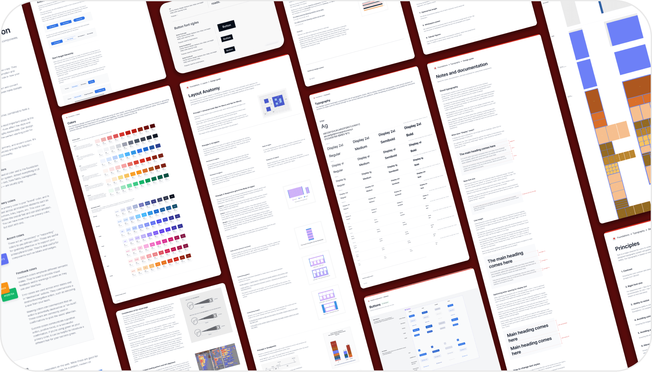
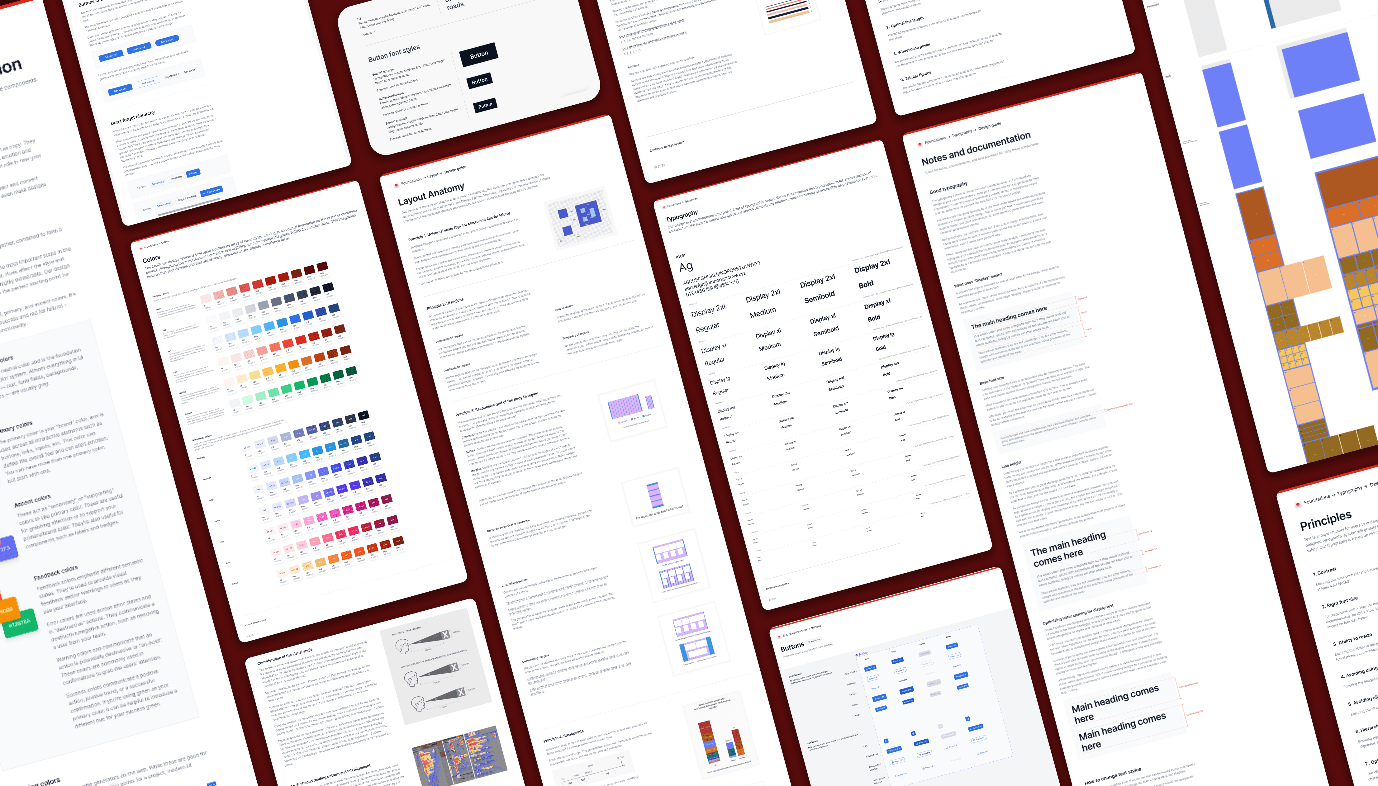
A comprehensive UX documentation library
A repository of UI resources
A collection of developer-friendly UI components
Accessibility Theming
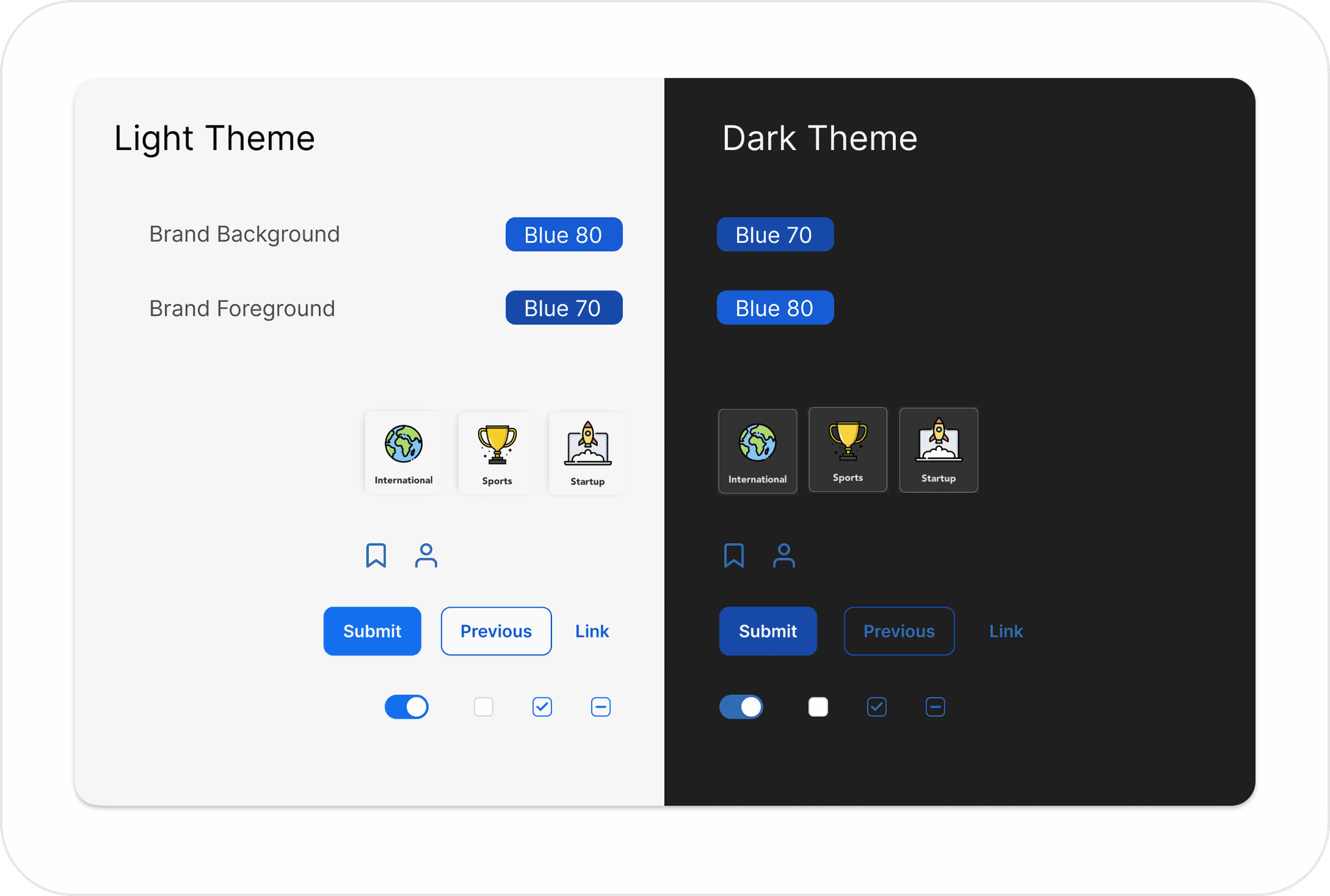
ZenGrove’s robust design system were built for flexibility and accessibility. That means that right out of the box, our design system support OS theming for light, dark, high-contrast, and branded elements, as well as ensure sufficient color contrast across the system.
The UX documentation library contains:
Content
Takeaways
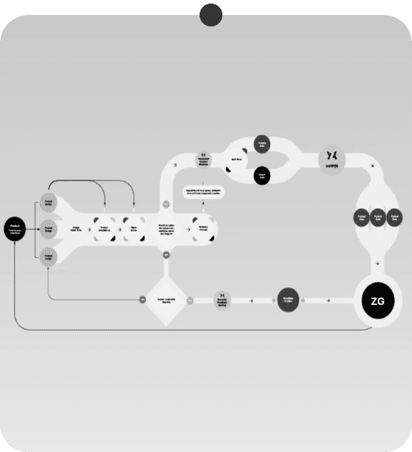
Established design flow foundation
Created governance & Contribution process
The impact of the design system has been profound, presenting challenges but yielding extensive benefits for the company across various domains:
Simplification for developers, enabling unified discussions with the cross functional team and a focus on features over intricate UI elements.
Swift creation of high-fidelity interfaces, reducing design time from days to mere hours with a readily available component library.
Facilitation of rapid prototyping, enabling extensive idea testing, hypothesis evaluation, and diverse A/B testing variations.
